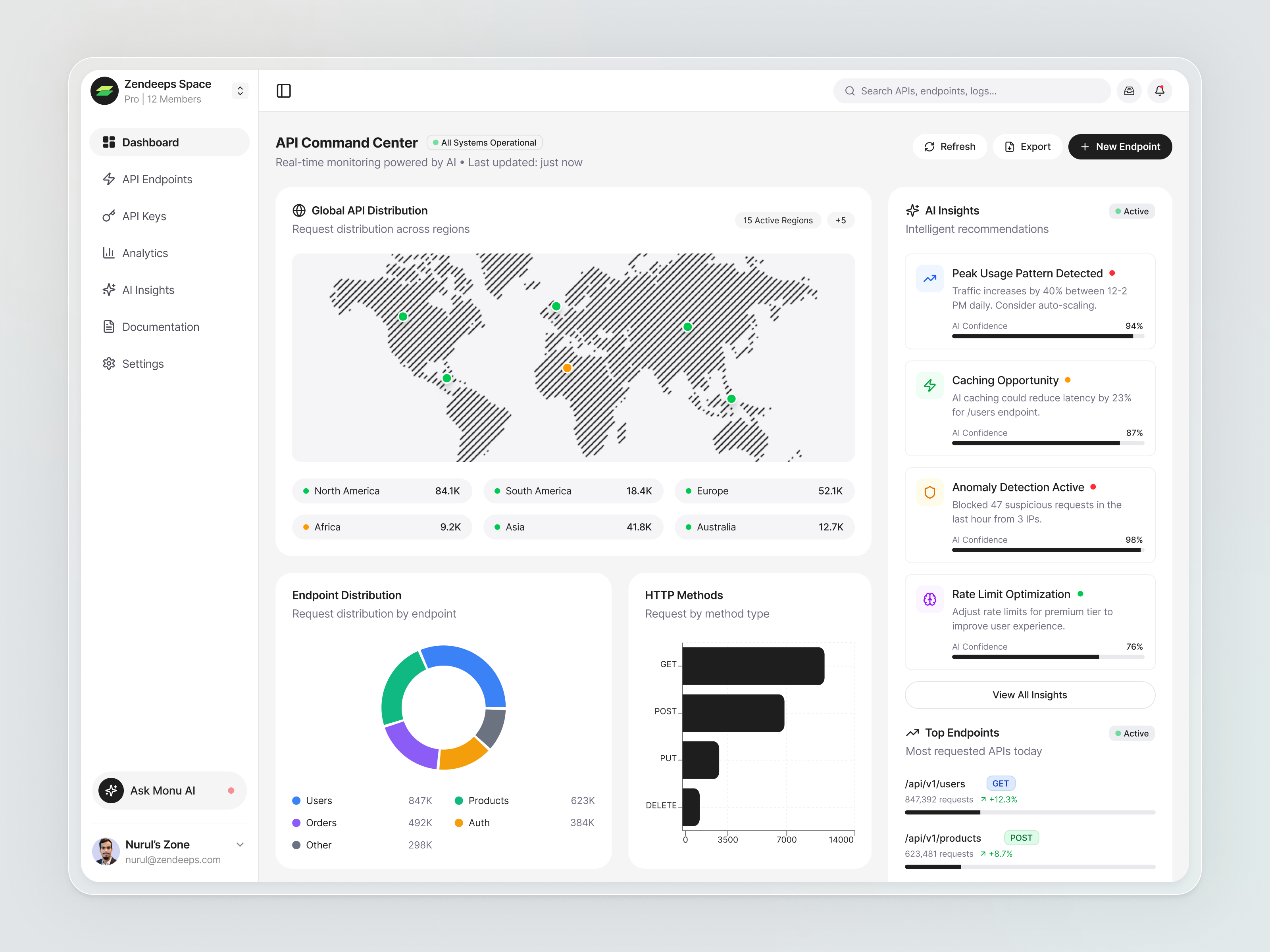
We build robust, well-documented design systems that streamline your workflow, ensure brand consistency, and help your team ship faster at scale.
We build comprehensive design systems that ensure visual consistency, speed up development, and scale effortlessly as your product grows.
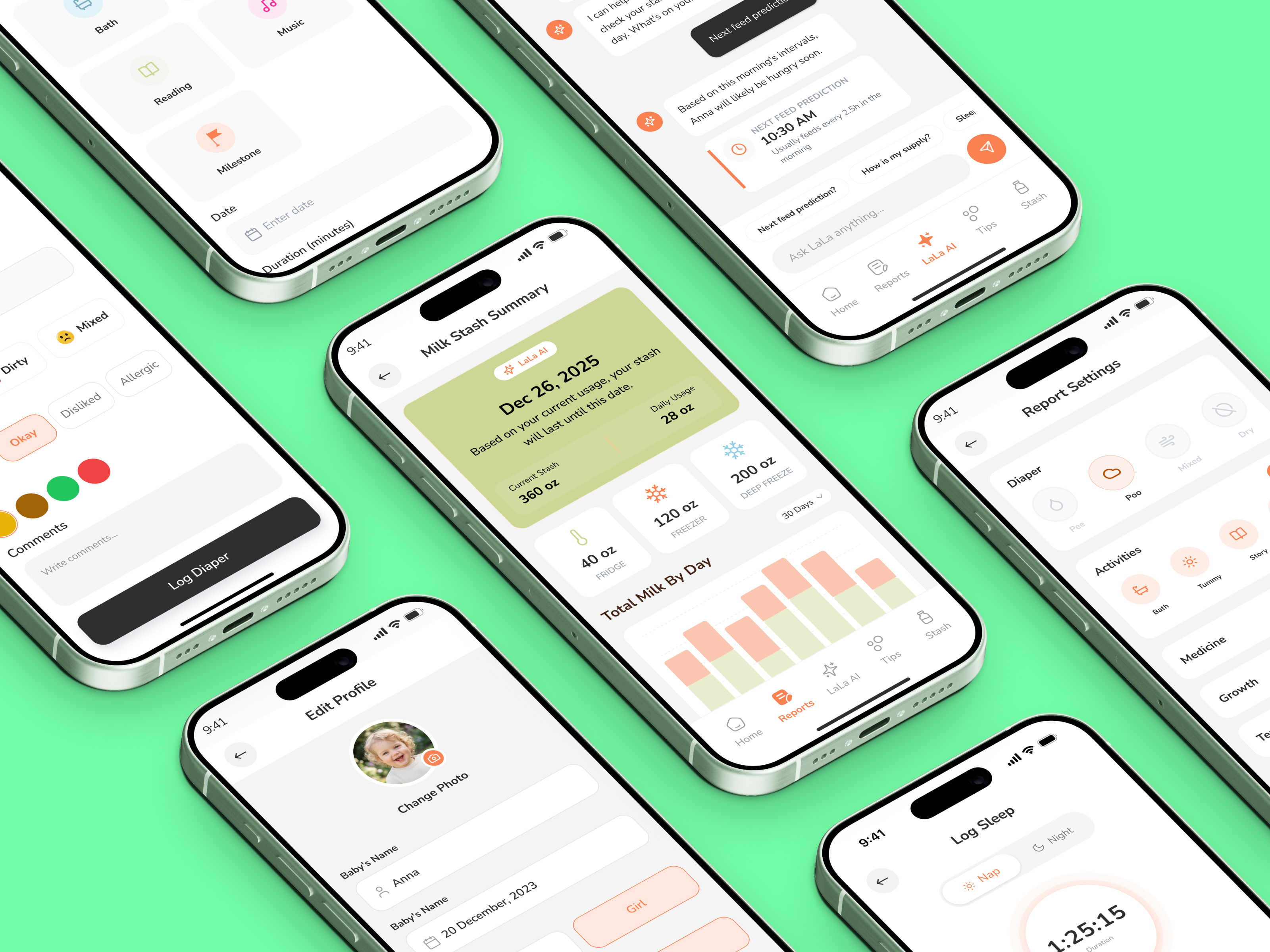
We build a comprehensive library of reusable UI components—buttons, forms, cards, modals—with consistent styling and flexible variants.
We define color palettes, typography scales, spacing systems, and elevation tokens that form the foundation of your visual language.
We create clear documentation with usage guidelines, do's and don'ts, and code examples so your team uses the system correctly.
We design recurring UI patterns—navigation, data tables, empty states, error handling—so common scenarios are solved consistently.
We align Figma component structure with your frontend framework so designers and developers speak the same language.
We establish governance processes for maintaining, versioning, and evolving your design system as your product and team grow.